There’s a particular kind of annoying software that manages to be in your way yet easy to ignore at the same time.
Notifications are a good example. A box appears in the corner of your screen, then another, until the stack covers something you’re trying to read. Eventually, you start dismissing them without looking.
We ran into this with our own form factor explorations at Highlight. Past iterations took up space, interrupted what you were doing, and didn’t reliably get useful information across. For a product meant to absorb the friction of work, we were adding some of our own.
I wanted us to rethink how we showed up on someone’s screen. Highlight needed to be easy to reach throughout the day without constantly asking you to stop what you were doing.
Coming at this from both design and engineering, I kept returning to two questions: Could something stay available without repeatedly announcing itself? Could you know where to find it when you needed it, and have it stay out of the way when you didn’t?
That became the guiding idea behind the Notch: always there, never in your way.
Working With Existing Spaces
The top of the screen felt like a promising place to start. There was unused real estate around the notch, outside the main area where you write, read, and work.
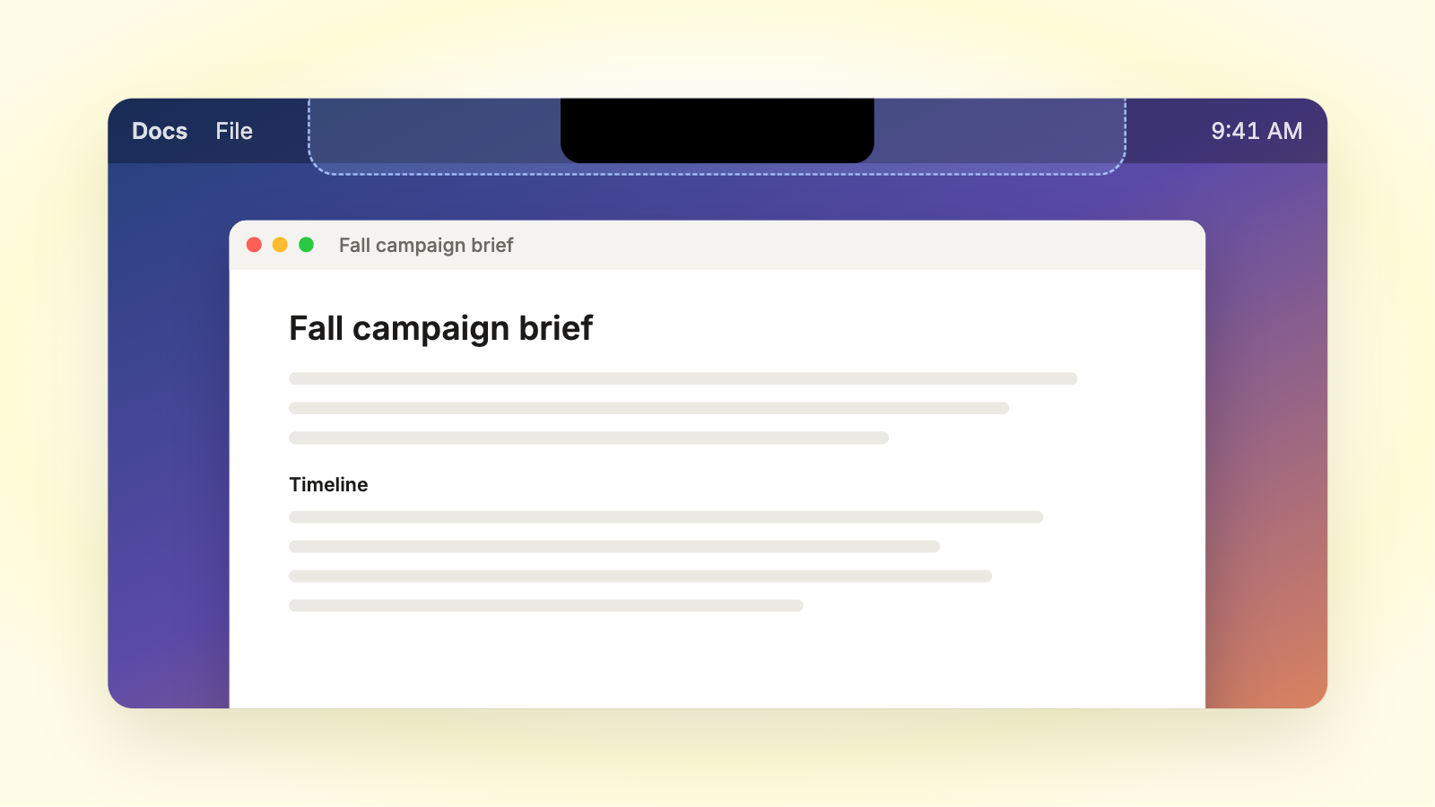
I wanted to use that space carefully. We’d already seen how frustrating an interface could be when it took up too much room. For me, the design and engineering questions were connected: how small could we keep it and still make it useful? What would happen on a smaller display? How would it feel after having it on your screen all day?
We kept the constraints simple. Fit within the menu bar when idle. Use as little vertical space as possible. Avoid shifting things around as it opens. Keep information easy to glance at and controls easy to reach. Hide it in plain sight until someone needs something.
What is Highlight’s Notch?
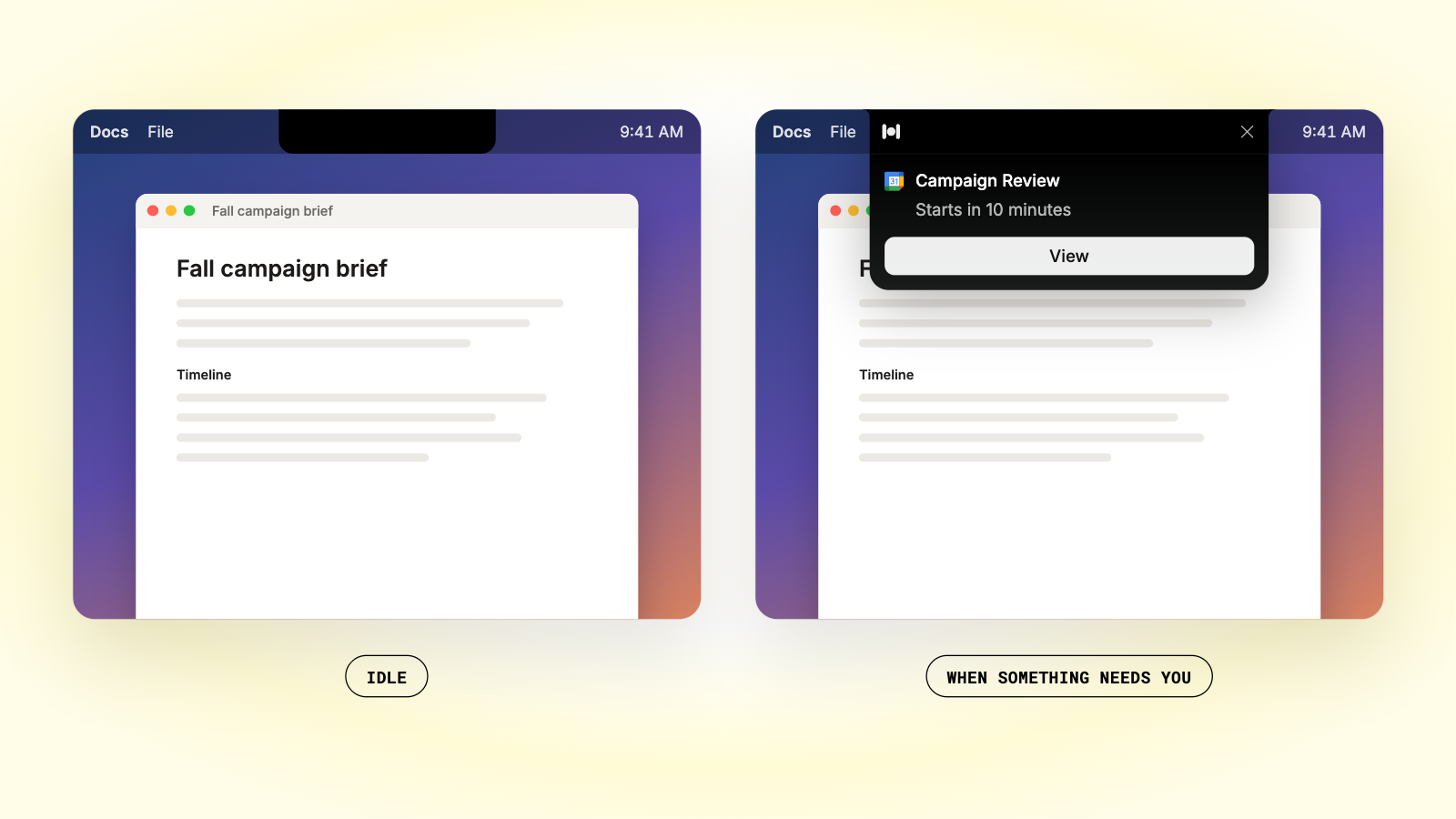
Highlight’s Notch is a small bar at the top of your screen that gives Highlight’s notifications, chat and meeting controls one home. On a Mac, it sits at the top center of your screen, around the camera notch. On Windows and external displays, it adapts to fit the top of the screen.
In an idle state, it stays tucked into the menu bar. When something needs you, it drops down to show the notification.
What Can You Do With Highlight’s Notch?
You can see meetings, reminders and chat updates in one place at the top of your screen, instead of stacked in the corner.
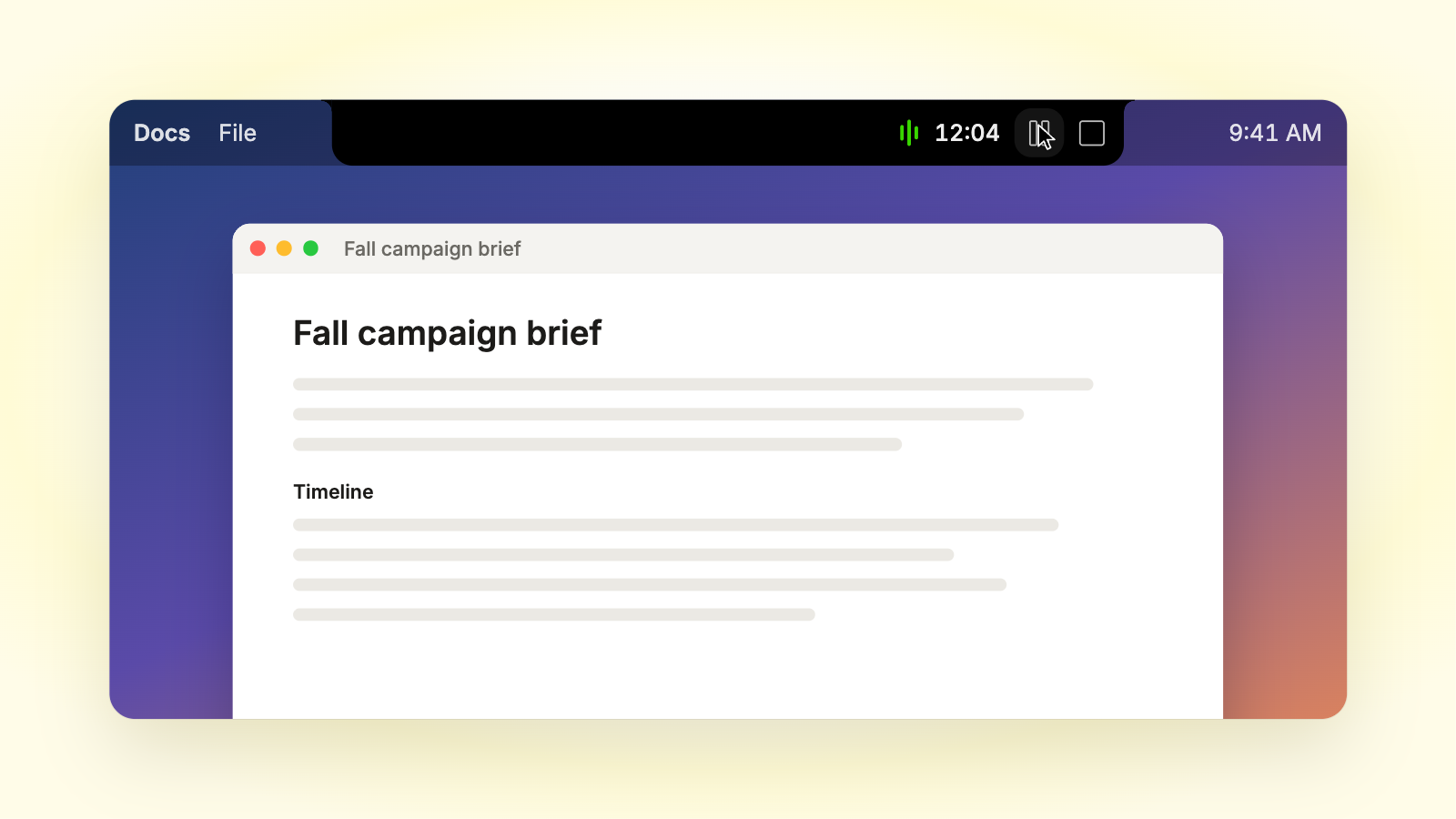
Meeting reminders drop down with a button to join. Hover over the Notch to ask Highlight a question or start a meeting note without opening the app. While recording, you can check the elapsed time, pause, resume, or stop from the same place.
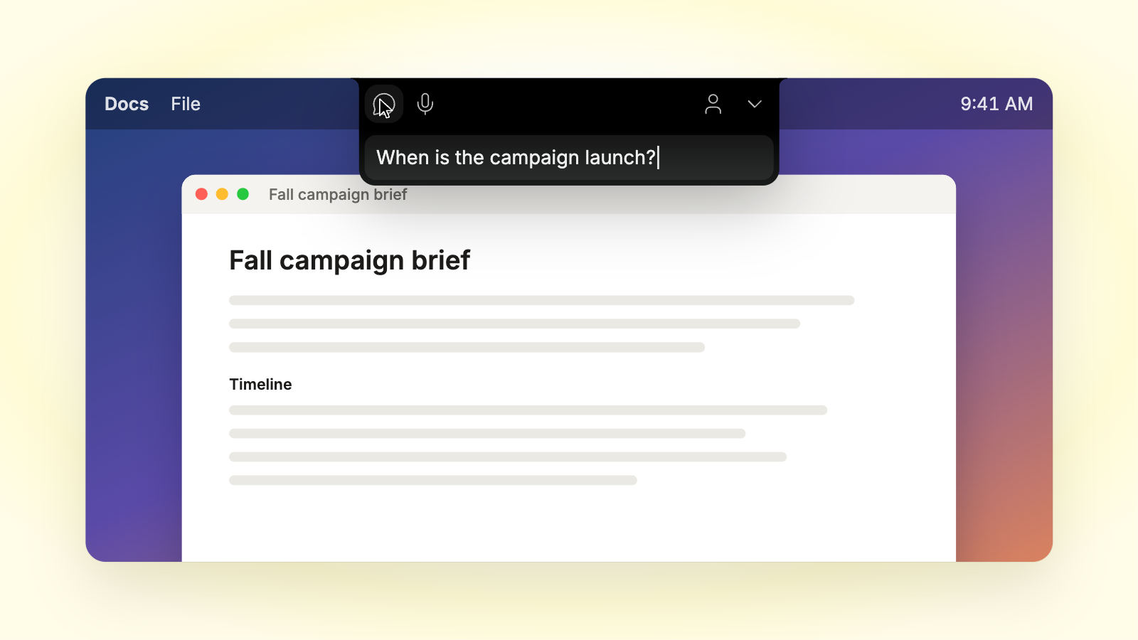
I like that location for meetings in particular. Keeping a small preview near the camera means your eyes don’t have to travel as far to check it. You can get to what you need without pulling your attention across the screen. That’s what “always there, never in your way” looks like in practice.
Let The Notch Fit Into Your Day
“Always there, never in your way” is something I want us to keep checking as we build. It’s easy to make room for one more message or one more control. Those decisions add up, and eventually you can end up with the same clutter you started with.
I want you to be able to check a recording, reach a meeting control, or ask a question, then get back to what you were doing. And when you don’t need any of those things, I want us to be comfortable leaving that space hidden.
Try Highlight’s Notch during your next workday. It’s designed to be there when you need it and let you carry on when you don’t.

